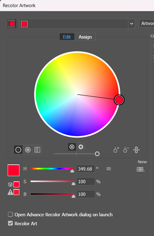
Hue or the color is represented by its angle or position on the color wheel. The saturation of that color is represented by how close the circle is to the center, meaning very desaturated, or how close it is to the outside of the circle, meaning very saturated. To change brightness, we use this additional slider as shown below in Recolor Artwork panel in Adobe Illustrator. Color shown in the color wheel has R=255,G=0,B=44.
Tint and Shades
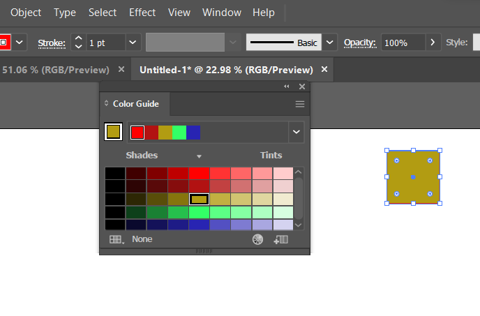
A tint is adding white and a shade is adding black. And we can do this through Color guide panel in Adobe Illustrator. Open the color guide, and select the color. As shown in below image, as we move left, we have darker shades and to its right, we have lighter tints.
Opacity
No matter how light the tint, the tint is going to be opaque. So if tint layer is on top of the image, it will obscure the image. So if we want to be able to see through the colors, then we need opacity. To change the opacity in Illustrator, we use the transparency panel. If the opacity is less than 100, we are going to be able to see through that color. Now, in addition to the percentage of opacity, we also have the blending mode. Blending modes determine how the colors of the top object blend with any colors that are beneath it. They are non-destructive. So if you go wrong, you can just set things back to how they were.